Otterz Product Design
The problem
Our solution
Feb 2024 - May 2024
UX/UI Design Contract
Breaking into the crowded financial services industry, Otterz faced the challenge of building trust and standing out in a space dominated by legacy brands. They needed a clear, modern identity that reflected both technological innovation and financial reliability. To support this, we developed a refined design system, user-centered flows, and actionable user research to ensure the brand spoke directly to user expectations and behaviors.
Team: Andrew Lin, Emily Xu, Carter Chen, Kayla Choi, Alexa Rahardjo
Modernization: We'll develop a refreshed Design System to innovate and unite the design language in both website and product
Intuitive Interfaces: We'll prioritize clarity of user-flow direction and visibility of key features for a more natural user experience
Integrated architecture: We'll restructure product features and functionalities to create a more seamless and ultimately useful product
My Role/Responsibilities
Project Manager, UX/UI Design, Design System, Product Design
What sets Otterz apart in the saturated fintech industry?
Competitive Analysis
I analyzed the user flows of five key competitors while the rest of my team compiled key growth points of the existing Otterz platform.
-
Centralized user interfaces, minimizing steps between each feature.
-
Simplified financial metrics & summaries, increasing clarity of data and its contexts.
-
Custom and adaptable user interfaces, to suit a variety of financial goals.

User insights & priorities
Key Insights
-
Some features are buried in menus - preventing intuitive access and slowing down interactions.
-
More customizability of dashboard financial metrics & priorities are preferred over set metrics & an overview
-
Increased font and graph readability needed - low contrasts between identifying colors, and fonts are too small.
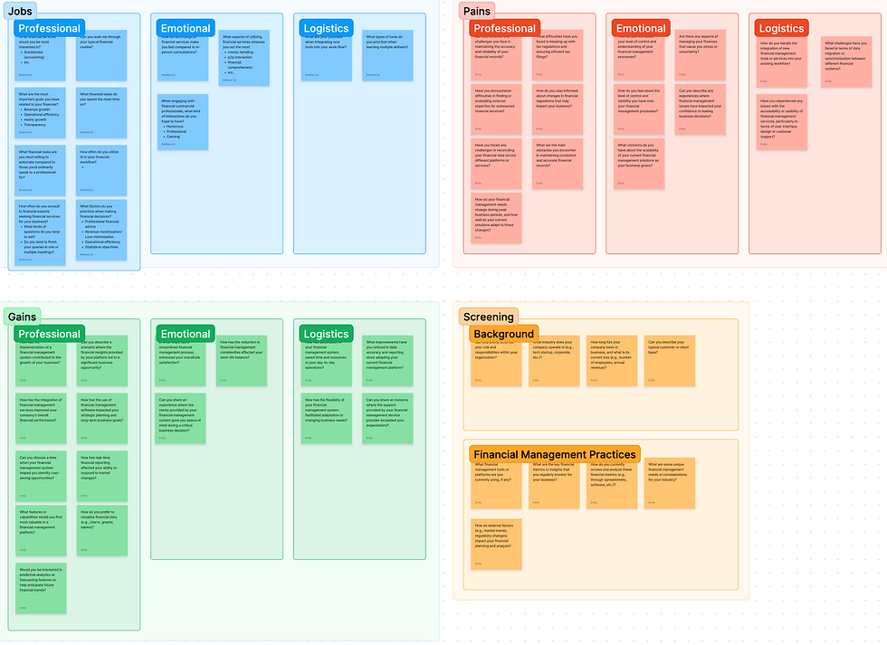
The survey was conducted through Pollfish, covering 100 people with the intent to uncover the key Jobs, Gains, & Pains of the existing Otterz user interface
Low Fidelity
For the first set of mock ups, we focused on two objectives: layout, and shape language. We wanted to maximize the efficiency of information per screen space, while maintaining clarity of information and ability to aesthetically convey the general ideas and feel of the abstracted data.


Design System
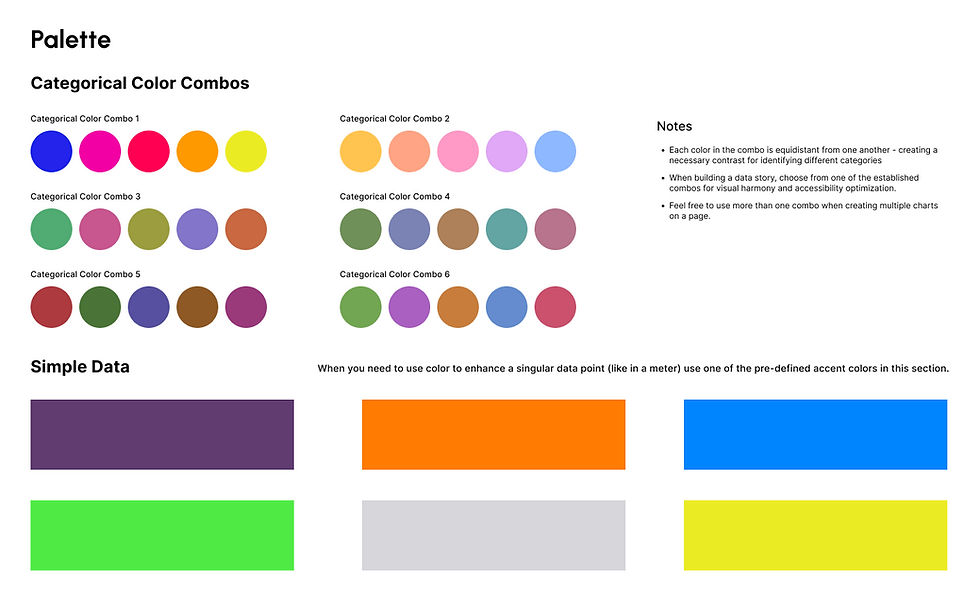
My teammate and I were in charge of the design system, opting for a concept of high modernist accents within minimalist flat containers. This approach captures the essence of Otterz's ethos, blending innovation with simplicity to deliver a seamless and intuitive user experience.


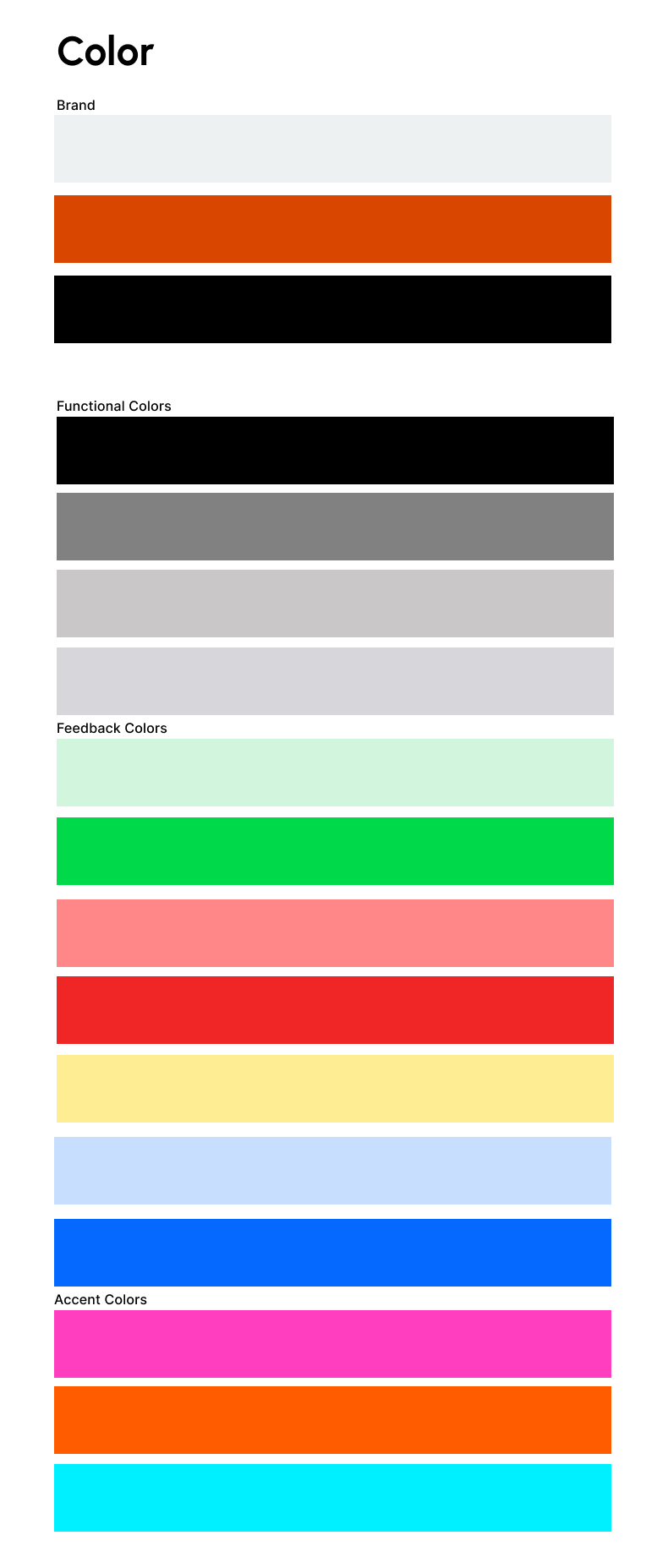
Colour Palette
Mobile Screens
Dashboard & AI
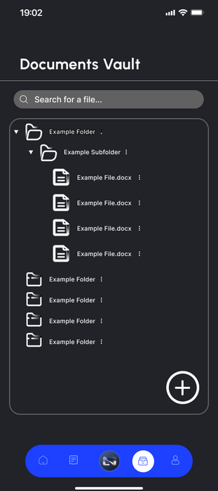
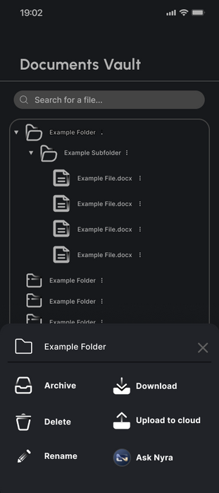
Folders & File Access
Account Setup
Final Deliverables
Desktop Screens


Reflection
I gained valuable experience in creating a comprehensive design system and organizing the final deliverable. Additionally, I learned how to meet both client and user needs effectively. Working with a team of talented designers was incredibly rewarding, and our collaborative efforts resulted in a meaningful outcome. I also developed skills in managing client communications, which was essential for ensuring the project's success.


